
Speed Bins
Includes a new Speed Bins section in the path analysis stack.
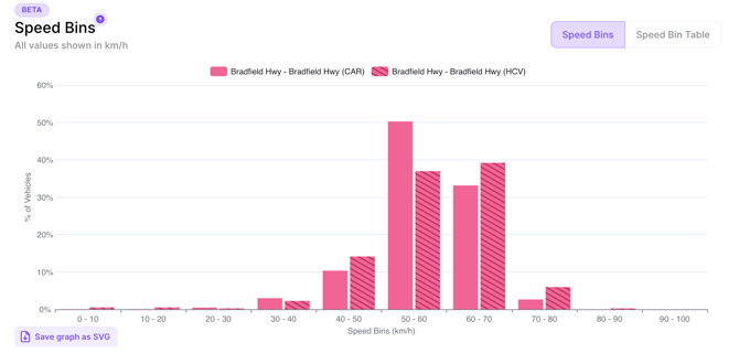
The speed tables and graphs draw their data from point-level information, not trajectory-level information. Point-level data is simply the data associated with each event marker sent by the vehicle as it passed through the selected region, not an average or other form of aggregation of the vehicle’s trip through the selected region.
- Speed binning as a bar chart. It shows the percentages of vehicles distributed among speed ranges along a selected section of road. It bins the speeds into categories, as seen on the X-Axis. In the graph, you can see the distribution, where HCV data between 0 and 10 km/h represents 0.5% of the volume. It's important to note that data is gathered at the point-level, not the trip-level:
2. Speed Binning as a table. This table shows the percentage of vehicles that fit into each respective speed bin. Vehicle types are separated into separate Speed Bin tables, similar to how there are separate G-force distribution graphs for CARS and HCV data. For example, we can see the Average, Standard Deviation, 15th, 50th, and 85th percentiles of speeds for CAR broken down by hour, as percentages of vehicles in each bin. This does not provide instant insights but rather a comparative metric.

Note: There are separate Speed Bin tables for CAR and HCV data if you scroll further down the results panel.
